We’ve all used a form to login, submit a help request, place an order, book a flight, schedule a meeting and perform countless other data entry tasks. Forms are the mainstay of business applications.
Any seasoned web developer can slap together an HTML form with all the right tags. It's more challenging to create a cohesive data entry experience that guides the user efficiently and effectively through the workflow behind the form.
That takes design skills that are, to be frank, well out of scope for this chapter.
It also takes framework support for two-way data binding, change tracking, validation, and error handling ... which we shall cover in this chapter on Angular forms.
We will build a simple form from scratch, one step at a time. Along the way we'll learn
How to build an Angular form with a component and template
The
ngModeltwo-way data binding syntax for reading and writing values to input controlsThe
ngControldirective to track the change state and validity of form controlsThe special CSS classes that
ngControladds to form controls and how we can use them to provide strong visual feedbackHow to display validation errors to users and enable/disable form controls
How to share information across controls with template local variables
Template-Driven Forms
Many of us will build forms by writing templates in the Angular template syntax with the form-specific directives and techniques described in this chapter.
That's not the only way to create a form but it's the way we'll cover in this chapter.
We can build almost any form we need with an Angular template — login forms, contact forms ... pretty much any business forms. We can lay out the controls creatively, bind them to data, specify validation rules and display validation errors, conditionally enable or disable specific controls, trigger built-in visual feedback, and much more.
It will be pretty easy because Angular handles many of the repetitive, boiler plate tasks we'd otherwise wrestle with ourselves.
We'll discuss and learn to build the following template-driven form:
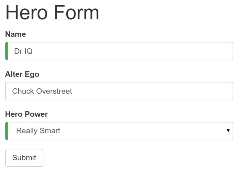
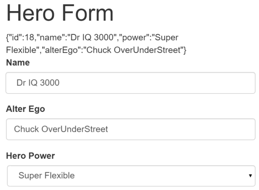
Here at the Hero Employment Agency we use this form to maintain personal information about the heroes in our stable. Every hero needs a job. It's our company mission to match the right hero with the right crisis!
Two of the three fields on this form are required. Required fields have a green bar on the left to make them easy to spot.
If we delete the hero name, the form displays a validation error in an attention grabbing style:
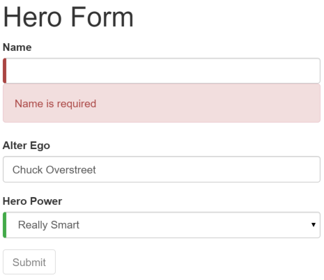
Note that the submit button is disabled and the "required" bar to the left of the input control changed from green to red.
We'll' customize the colors and location of the "required" bar with standard CSS.
We will build this form in the following sequence of small steps
- Create the
Heromodel class - Create the component that controls the form
- Create a template with the initial form layout
- Add the ngModel directive to each form input control
- Add the ngControl directive to each form input control
- Add custom CSS to provide visual feedback
- Show and hide validation error messages
- Handle form submission with ngSubmit
- Disable the form’s submit button until the form is valid
Setup
Create a new project folder (angular2-forms) and follow the steps in the QuickStart.
Create the Hero Model Class
As users enter form data, we capture their changes and update an instance of a model. We can't layout the form until we know what the model looks like.
A model can be as simple as a "property bag" that holds facts about a thing of application importance.
That describes well our Hero class with its three required fields (id, name, power)
and one optional field (alterEgo).
Create a new file in the app folder called hero.ts and give it the following class definition:
It's an anemic model with few requirements and no behavior. Perfect for our demo.
The TypeScript compiler generates a public field for each public constructor parameter and
assigns the parameter’s value to that field automatically when we create new heroes.
The alterEgo is optional and the constructor lets us omit it; note the (?) in alterEgo?.
We can create a new hero like this:
Create a Form component
An Angular form has two parts: an HTML-based template and a code-based Component to handle data and user interactions.
We begin with the Component because it states, in brief, what the Hero editor can do.
Create a new file called hero-form.component.ts and give it the following definition:
There’s nothing special about this component, nothing form-specific, nothing to distinguish it from any component we've written before.
Understanding this component requires only the Angular 2 concepts we’ve learned in previous chapters
We import the
Componentdecorator from the Angular library as we usually do.The
@Componentselector value of "hero-form" means we can drop this form in a parent template with a<hero-form>tag.The
templateUrlproperty points to a separate file for template HTML calledhero-form.component.html.We defined dummy data for
modelandpowersas befits a demo. Down the road, we can inject a data service to get and save real data or perhaps expose these properties as inputs and outputs for binding to a parent component. None of this concerns us now and these future changes won't affect our form.We threw in a
diagnosticproperty at the end to return a JSON representation of our model. It'll help us see what we're doing during our development; we've left ourselves a cleanup note to discard it later.
Why don't we write the template inline in the component file as we often do elsewhere in the Developer Guide?
There is no “right” answer for all occasions. We like inline templates when they are short. Most form templates won't be short. TypeScript and JavaScript files generally aren't the best place to write (or read) large stretches of HTML and few editors are much help with files that have a mix of HTML and code. We also like short files with a clear and obvious purpose like this one.
We made a good choice to put the HTML template elsewhere.
We'll write that template in a moment. Before we do, we'll take a step back
and revise the app.component.ts to make use of our new HeroFormComponent.
Revise the app.component.ts
app.component.ts is the application's root component. It will host our new HeroFormComponent.
Replace the contents of the "QuickStart" version with the following:
There are only three changes:
We import the new
HeroFormComponent.The
templateis simply the new element tag identified by the component'sselectorproperty.The
directivesarray tells Angular that our template depends upon theHeroFormComponentwhich is itself a Directive (as are all Components).
Create an initial HTML Form Template
Create a new template file called hero-form.component.html and give it the following definition:
That is plain old HTML 5. We're presenting two of the Hero fields, name and alterEgo, and
opening them up for user input in input boxes.
The Name <input> control has the HTML5 required attribute;
the Alter Ego <input> control does not because alterEgo is optional.
We've got a Submit button at the bottom with some classes on it.
We are not using Angular yet. There are no bindings. No extra directives. Just layout.
The container,form-group, form-control, and btn classes
come from Twitter Boostrap. Purely cosmetic.
We're using Bootstrap to gussy up our form.
Hey, what's a form without a little style!
Angular makes no use of the container, form-group, form-control, and btn classes or
the styles of any external library. Angular apps can use any CSS library
... or none at all.
Let's add the stylesheet.
- Open a terminal window in the application root folder and enter the command:
npm install bootstrap --save - Open
index.htmland add the following link to the<head>.<link rel="stylesheet" href="node_modules/bootstrap/dist/css/bootstrap.min.css">
Add Powers with *ngFor
Our hero may choose one super power from a fixed list of Agency-approved powers.
We maintain that list internally (in HeroFormComponent).
We'll add a select to our
form and bind the options to the powers list using NgFor,
a technique we might have seen before in the Displaying Data chapter.
Add the following HTML immediately below the Alter Ego group.
We are repeating the <options> tag for each power in the list of Powers.
The #p local template variable is a different power in each iteration;
we display its name using the interpolation syntax with the double-curly-braces.
Two-way data binding with *ngModel
Running the app right now would be disappointing.
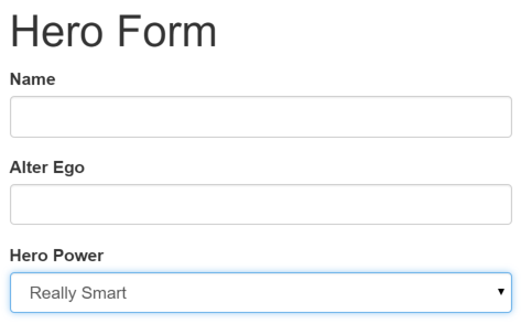
We don't see hero data because we are not binding to the Hero yet.
We know how to do that from earlier chapters.
Displaying Data taught us Property Binding.
User Input showed us how to listen for DOM events with an
Event Binding and how to update a component property with the displayed value.
Now we need to display, listen, and extract at the same time.
We could use those techniques again in our form.
Instead we'll introduce something new, the NgModel directive, that
makes binding our form to the model super-easy.
Find the <input> tag for the "Name" and update it like this
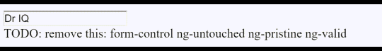
We appended a diagnostic interpolation after the input tag so we can see what we're doing. We left ourselves a note to throw it way when we're done.
Focus on the binding syntax: [(ngModel)]="...".
If we ran the app right now and started typing in the Name input box, adding and deleting characters, we'd see them appearing and disappearing from the interpolated text. At some point it might look like this.
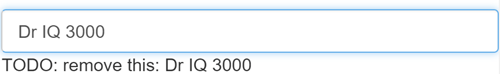
The diagnostic is evidence that we really are flowing values from the input box to the model and back again. That's two-way data binding!
Let's add similar [(ngModel)] bindings to Alter Ego and Hero Power.
We'll ditch the input box binding message
and add a new binding at the top to the component's diagnostic property.
Then we can confirm that two-way data binding works for the entire Hero model.
After revision the core of our form should have three [(ngModel)] bindings that
look much like this:
If we ran the app right now and changed every Hero model property, the form might display like this:
The diagnostic near the top of the form confirms that all of our changes are reflected in the model.
Delete the {{diagnostic}} binding at the top as it has served its purpose.
Inside [(ngModel)]
This section is an optional deep dive into [(ngModel)]. Not interested? Skip ahead!
The punctuation in the binding syntax, [()], is a good clue to what's going on.
In a Property Binding, a value flows from the model to a target property on screen. We identify that target property by surrounding its name in brackets, []. This is a one-way data binding from the model to the view.
In an Event Binding, we flow the value from the target property on screen to the model. We identify that target property by surrounding its name in parentheses, (). This is a one-way data binding in the opposite direction from the view to the model.
No wonder Angular chose to combine the punctuation as [()] to signify a two-way data binding and a flow of data in both directions.
In fact, we can break the NgModel binding into its two separate modes
as we do in this re-write of the "Name" <input> binding:
The Property Binding should feel familiar. The Event Binding might seem strange.
The ngModelChange is not an <input> element event.
It is actually an event property of the NgModel directive.
When Angular sees a binding target in the form [(abc)],
it expects the abc directive to have an abc input property and an abc-change output property.
The other oddity is the template expression, model.name = $event.
We're used to seeing an $event object coming from a DOM event.
The ngModelChange property doesn't produce a DOM event; it's an Angular EventEmitter
property that returns the input box value when it fires — which is precisely what
we should assign to the model's `name' property.
Nice to know but is it practical? We almost always prefer [(ngModel)].
We might split the binding if we had to do something special in
the event handling such as debounce or throttle the key strokes.
Learn more about NgModel and other template syntax in the
Template Syntax chapter.
Track change-state and validity with ngControl
A form isn't just about data binding. We'd also like to know the state of the controls on our form.
The NgControl directive keeps track of control state for us.
The NgControl is one of a family of NgForm directives that can only be applied to
a control within a <form> tag.
Our application can ask an NgControl if the user touched the control,
if the value changed, or if the value became invalid.
NgControl doesn't just track state; it updates the control with special
Angular CSS classes from the set we listed above.
We can leverage those class names to change the appearance of the
control and make messages appear or disappear.
We'll explore those effects soon. Right now
we should add ngControlto all three form controls,
starting with the Name input box
Be sure to assign a unique name to each ngControl directive.
Angular registers controls under their ngControl names
with the NgForm.
We didn't add the NgForm directive explicitly but it's here
and we'll talk about it later in this chapter.
Add Custom CSS for Visual Feedback
NgControl doesn't just track state.
It updates the control with three classes that reflect the state.
| State | Class if true | Class if false |
|---|---|---|
| Control has been visited | ng-touched | ng-untouched |
| Control's value has changed | ng-dirty | ng-pristine |
| Control's value is valid | ng-valid | ng-invalid |
Let's add a temporary local template variable named spy
to the "Name" <input> tag and use the spy to display those classes.
Now run the app and focus on the Name input box. Follow the next four steps precisely
- Look but don't touched
- Click in the input box, then click outside the text input box
- Add slashes to the end of the name
- Erase the name
The actions and effects are as follows:
We should be able to see the following four sets of class names and their transitions:
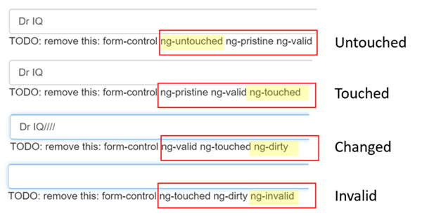
The (ng-valid | ng-invalid) pair are most interesting to us. We want to send a
strong visual signal when the data are invalid and we want to mark required fields.
We realize we can do both at the same time with a colored bar on the left of the input box:
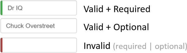
We achieve this effect by adding two styles to a new styles.css file
that we add to our project as a sibling to index.html.
These styles select for the two Angular validity classes and the HTML 5 "required" attribute.
We update the <head> of the index.html to include this style sheet.
Show and Hide Validation Error messages
We can do better.
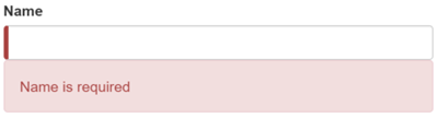
The "Name" input box is required. Clearing it turns the bar red. That says something is wrong but we
don't know what is wrong or what to do about it.
We can leverage the ng-invalid class to reveal a helpful message.
Here's the way it should look when the user deletes the name:
To achieve this effect we extend the <input> tag with
- a local template variable
- the "is required" message in a nearby
<div>which we'll display only if the control is invalid.
Here's how we do it for the name input box:
When we added the ngControl directive, we bound it to the the model's name property.
Here we initialize a template local variable (name) with the value "ngForm" (#name="ngForm").
Angular recognizes that syntax and re-sets the name local template variable to the
ngControl directive instance.
In other words, the name local template variable becomes a handle on the ngControl object
for this input box.
Now we can control visibility of the "name" error message by binding the message <div> element's hidden property
to the ngControl object's valid property. The message is hidden while the control is valid;
the message is revealed when the control becomes invalid.
The NgForm directive
We just set a template local variable with the value of an NgForm directive.
Why did that work? We didn't add the NgForm directive explicitly.
Angular added it surreptiously, wrapping it around the <form> element
The NgForm directive supplements the form element with additional features.
It collects Controls (elements identified by an ngControl directive)
and monitors their properties including their validity.
It also has its own valid property which is true only if every contained
control is valid.
The Hero Alter Ego is optional so we can leave that be.
Hero Power selection is required.
We can add the same kind of error handling to the <select> if we want
but it's not imperative because the selection box already constrains the
power to valid value.
Submit the form with ngSubmit
The user should be able to submit this form after filling it in.
The Submit button at the bottom of the form
does nothing on its own but it will
trigger a form submit because of its type (type="submit").
A "form submit" is useless at the moment.
To make it useful, we'll update the <form> tag with another Angular directive, NgSubmit,
and bind it to the HeroFormComponent.submit() method with an event binding
We slipped in something extra there at the end! We defined a
template local variable, #heroForm, and initialized it with the value, "ngForm".
The variable heroForm is now a handle to the NgForm directive that we discussed earlier
This time heroForm remains a reference to the form as a whole.
Later in the template we bind the button's disabled property to the form's over-all validity via
the heroForm variable. Here's that bit of markup:
Re-run the application. The form opens in a valid state and the button is enabled.
Now delete the Name. We violate the "name required" rule which is duely noted in our error message as before. And now the Submit button is also disabled.
Not impressed? Think about it for a moment. What would we have to do to wire the button's enable/disabled state to the form's validity without Angular's help?
For us, it was as simple as
- Define a template local variable on the (enhanced) form element
- Reference that variable in a button some 50 lines away.
Toggle two form regions (extra credit)
Submitting the form isn't terribly dramatic at the moment.
An unsurprising observation for a demo. To be honest, jazzing it up won't teach us anything new about forms. But this is an opportunity to exercise some of our newly won binding skills. If you're not interested, you can skip to the chapter's conclusion and not miss a thing.
Let's do something more strikingly visual. Let's hide the data entry area and display something else.
Start by wrapping the form in a <div> and bind
its hidden property to the HeroFormComponent.submitted property.
The main form is visible from the start because the
the submitted property is false until we submit the form,
as this fragment from the HeroFormComponent reminds us:
When we click the Submit button, the submitted flag becomes true and the form disappears
as planned.
Now we need to show something else while the form is in the submitted state.
Add the following block of HTML below the <div> wrapper we just wrote:
There's our hero again, displayed read-only with interpolation bindings. This slug of HTML only appears while the component is in the submitted state.
We added an Edit button whose click event is bound to an expression
that clears the submitted flag.
When we click it, this block disappears and the editable form reappears.
That's as much drama as we can muster for now.
Conclusion
The Angular 2 form discussed in this chapter takes advantage of the following framework features to provide support for data modification, validation and more:
- An Angular HTML form template.
- A form component class with a
Componentdecorator. - The
ngSubmitdirective for handling the form submission. - Template local variables such as
#heroForm,#name,#alter-egoand#power. - The
ngModeldirective for two-way data binding. - The
ngControlfor validation and form element change tracking. - The local variable’s
validproperty on input controls to check if a control is valid and show/hide error messages. - Controlling the submit button's enabled state by binding to
NgFormvalidity. - Custom CSS classes that provide visual feedback to users about invalid controls.
Our final project folder structure should look like this:
Here’s the final version of the source: