An Attribute directive changes the appearance or behavior of a DOM element.
In this chapter we will
- write an attribute directive to change the background color
- apply the attribute directive to an element in a template
- respond to user-initiated events
- pass values into the directive using data binding
Directives overview
There are three kinds of directives in Angular:
- Components
- Structural directives
- Attribute directives
The Component is really a directive with a template. It's the most common of the three directives and we write lots of them as we build our application.
The Structural directive changes the DOM layout by adding and removing DOM elements. NgFor and NgIf are two familiar examples.
The Attribute directive changes the appearance or behavior of an element. The built-in NgStyle directive, for example, can change several element styles at the same time.
We are going to write our own attribute directive to set an element's background color when the user hovers over that element.
We don't need any directive to simply set the background color. We can set it with the special Style Binding like this:
That wouldn't be nearly as much fun as creating our own directive.
Besides, we're not just setting the color; we'll be changing the color in response to a user action, a mouse hover.
Build a simple attribute directive
An attribute directive minimally requires building a controller class annotated with a
Directive decorator. The Directive decorator specifies the selector identifying
the attribute associated with the directive.
The controller class implements the desired directive behavior.
Let's build a small illustrative example together.
Our first draft
Create a new project folder (attribute-directives) and follow the steps in the QuickStart.
Add a new file to the app folder called highlight.directive.ts and add the following code:
We begin by importing some symbols from the Angular library.
We need the Directive symbol for the @Directive decorator.
We need symbols for the Element Reference and the Renderer service that
we will inject into the directive's constructor.
We don't need Input now but we will need it later in the chapter.
Then we define the directive metadata in a configuration object passed
as an argument to the @Directive decorator function.
A @Directive decorator for an attribute directive requires a css selector to identify
the HTML in the template that is associated with our directive.
The css selector for an attribute
is the attribute name in square brackets.
Our directive's selector is [myHighlight].
Angular will locate all elements in the template that have an attribute named myHighlight.
Why not call it "highlight"?
highlight is a nicer name than myHighlight and, technically, it would work if we called it that.
However, the good folks at Angular strongly prefer hyphenated directive selector names.
The HTML standards body will never name one of its attributes with a hyphen and there is
less risk of colliding with a third-party directive name when we give ours a prefix.
The ng prefix belongs to Angular.
We need a prefix of our own, preferably short, and my will do for now.
After the @Directive metadata comes the directive's controller class which we are exporting
to make it accessible to other components.
The directive's controller class contains the logic for the directive.
Angular creates a new instance of the directive's controller class for each matching element, injecting an Element Reference and the Renderer service as arguments to the constructor. We'll need those services to set the element's background color.
Our code shows two ways to set the color.
We could access the nativeElement property of the element reference
and set the element's background color using the browser DOM API. We don't need
the Renderer for this approach.
We commented this technique out. It works. But we don't like it.
We prefer the second way that relies on the Renderer service
to set the element properties.
Why prefer the Renderer?
Manipulating the DOM directly is a practice we'd rather avoid because it chains us to the browser DOM API.
The Renderer insulates our code from the browser's API.
That gives us options.
The rendering phase could be offloaded to a Web Worker for faster performance.
Our directive might work when we ran the application outside the browser,
perhaps on the server in a pre-render phase.
Server-side rendering can make our application load faster and
is often friendlier to Search Engine Optimizations (SEO).
Apply the attribute directive
The AppComponent will be the test harness for our HighlightDirective.
Let's give it a new template that
applies the directive as an attribute to a span element.
In Angular terms, the <span> element will be the attribute host.
We'll put the template in its own app.component.html file that looks like this:
A separate template file is clearly overkill for a 2-line template.
Hang in there; we're going to expand it later.
Meanwhile, we'll revise the AppComponent to reference this template.
We've added an import statement to fetch the 'Highlight' directive and
added that class to a directives array in the component metadata so that Angular
will recognize our directive when it encounters myHighlight in the template.
Angular would simply ignore the myHighlight attribute without it.
We run the app and see that our directive highlights the span text.
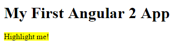
Let's recap what happened.
Angular found the myHighlight attribute on the <span> element. It created
an instance of the HighlightDirective class,
injecting both a reference to the element and the Renderer service into the constructor.
The constructor told the Renderer to set the <span> element's background style to yellow.
Respond to user action
We are not satisfied to simply set an element color. Our directive should set the color in response to a user action. Specifically, we want to set the color when the user mouses over the element.
We'll need to
- detect when the user mouses into and out of the element
- respond to those actions by setting and clearing the highlight color.
Start with event detection.
We add a host property to the directive metadata and give it a configuration object
that specifies two mouse events and the directive methods to call when they are raised.
The host property refers to the DOM element that hosts our attribute directive, the <span> in our case.
We could have attached an event listener to the native element (el.nativeElement) with
plain old JavaScript.
There are at least three problems with that approach:
- We have to write the listeners correctly.
- We must detach our listener when the directive is destroyed to avoid memory leaks.
- We'd be talking to DOM API directly which, we learned, is something to avoid.
Let's roll with the host property.
Now we implement those two mouse event handlers:
Notice that they delegate to a helper method that calls the Renderer service
as we used to do in the constructor.
We no longer need the constructor body but
we still want the injected ElementRef and Renderer service.
We revise the constructor signature to capture the injectables in private variables
and clear the body.
Here's the updated directive:
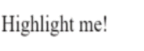
We run the app and confirm that the background color appears as we move the mouse over the span and
disappears as we move out.
Configure the directive with binding
Currently the highlight color is hard-coded within the directive. That's inflexible. We should set the highlight color externally with a binding like this:
We'll extend our directive class with a bindable input highlightColor property and use it when we highlight text.
Here is the final version of the class:
The new highlightColor property is called an "input" property because data flows from the binding expression into our directive.
Notice that we call the @Input() decorator function while defining the property.
This @Input decorator adds metadata to the class that makes the highlightColor property available for property binding
under the myHighlight alias.
We must add this input metadata.
Angular will reject a binding to this property if we don't declare it as an input.
See the appendix below to learn why.
The developer who uses our directive expects to bind to the attribute name, myHighlight.
The directive property name is highlightColor. That's a disconnect.
We can resolve the discrepancy by renaming the property to myHighlight and define it as follows:
Maybe we don't want that property name inside the directive perhaps because it
doesn't express our intention well.
We can alias the highlightColor property with the attribute name by
passing myHighlight into the @Input decorator:
Now that we're getting the highlight color as an input, we modify the onMouseEnter() method to use
it instead of the hard-coded color name.
We also define a red default color as a fallback in case
the user neglects to bind with a color.
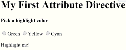
Now we'll update our AppComponent template to let
users pick the highlight color and bind their choice to our directive.
Here is the updated template:
Where is the templated color property?
The eagle-eyed may notice that the radio button click handlers in the template set a color property
and we are binding that color to the directive.
We should expect to find a color on the host AppComponent.
We never defined a color property for the host AppComponent!
And yet this code works. Where is the template color value going?
Browser debugging reveals that Angular dynamically added a color property
to the runtime instance of the AppComponent.
This is convenient behavior but it is also implicit behavior that could be confusing.
While it's cool that this technique works, we recommend adding the color property to the AppComponent.
Here is our second version of the directive in action.
Bind to a second property
Our directive only has a single, customizable property. What if we had two properties?
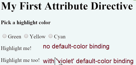
Let's let the template developer set the default color, the color that prevails until the user picks a highlight color.
We'll add a second input property to HighlightDirective called defaultColor:
The defaultColor property has a setter that overrides the hard-coded default color, "red".
We don't need a getter.
How do we bind to it? We already "burned" the myHighlight attribute name as a binding target.
Remember that a component is a directive too.
We can add as many component property bindings as we need by stringing them along in the template
as in this example that sets the a, b, c properties to the string literals 'a', 'b', and 'c'.
We do the same thing with an attribute directive.
Here we're binding the user's color choice to the myHighlight attribute as we did before.
We're also binding the literal string, 'violet', to the defaultColor.
Here is the final version of the directive in action.
Summary
Now we know how to
- build a simple attribute directive to attach behavior to an HTML element,
- use that directive in a template,
- respond to events to change behavior based on an event,
- and use binding to pass values to the attribute directive.
The final source:
Appendix: Input properties
Earlier we declared the highlightColor property to be an input property of our
HighlightDirective
We've seen properties in bindings before. We never had to declare them as anything. Why now?
Angular makes a subtle but important distinction between binding sources and targets.
In all previous bindings, the directive or component property was a binding source. A property is a source if it appears in the template expression to the right of the (=).
A property is a target when it appears to the *left of the (=) ...
as it is does when we bind to the myHighlight property of the HighlightDirective,
The 'color' in [myHighlight]="color" is a binding source.
A source property doesn't require a declaration.
The 'myHighlight' in [myHighlight]="color" is a binding target.
We must declare it as an input property.
Angular rejects the binding with a clear error if we don't.
Angular treats a target property differently for a good reason. A component or directive in target position needs protection.
Imagine that our HighlightDirective did truly wonderous things.
We graciously made a gift of it to the world.
To our surprise, some people — perhaps naively — started binding to every property of our directive. Not just the one or two properties we expected them to target. Every property. That could really mess up our directive in ways we didn't anticipate and have no desire to support.
The input declaration ensures that consumers of our directive can only bind to the properties of our public API ... nothing else.